
Most small retailers worry about how their store looks. The owners who grow revenue worry about how customers move through it. Layout is not a design problem — it is a behavior problem, and the difference matters because behavior is what drives sales.
Why Layout Is a Behavior Problem, Not a Design Problem
A store can look beautiful and still lose money on every aisle. What sells products is the path a customer takes once they walk in, the displays they actually stop at, and the friction they hit when deciding whether to grab something off a shelf. Those are behavioral outcomes, not aesthetic ones.
We covered the broader theory in our post on the psychology of store layouts. This piece is narrower: what shoppers actually do inside your store, what those actions reveal, and what you can change without a remodel.
How Do Customers Naturally Move Through a Store?
Most shoppers turn right when they enter and follow a counterclockwise path around the perimeter. This pattern is consistent across grocery, farm markets, and small specialty retail, and it shapes which products get seen and which get skipped.
Before customers commit to that path, they pass through the decompression zone. The decompression zone is the area just inside the entrance where shoppers transition from outside to inside the store. They slow down, adjust to the lighting, and barely register product. Anything placed in this zone tends to be ignored, which is why experienced retailers keep it open and uncluttered.
Past the decompression zone, the first major surface shoppers see is the power wall. The power wall is the first full wall a customer faces after entering and turning right, and it draws more visual attention than any other spot in the store. Whatever you put there gets seen first and remembered longest.
What Behaviors Signal a Layout Problem?
You do not need a heat map or a consultant to spot layout problems. You need to watch your customers. Specific behaviors point to specific issues, and most owners can identify them in a single afternoon on the floor.
- Shoppers walking straight past an entire section without slowing down. The section is either invisible from the main path or signals nothing worth stopping for.
- Customers picking up a product, looking for a price, and putting it back. The label is missing, unclear, or does not match the shelf tag.
- Endcaps that get a glance but no stops. Either the display is not differentiated from the regular shelf behind it, or the product on it does not match the shopper traffic at that point in the path.
- Bottlenecks at the checkout while the rest of the store sits empty. The checkout sightline is wrong, or the impulse area is forcing customers to stop in a high-traffic lane.
- Customers backtracking to find something they already passed. Categories are not grouped logically, or signage from the main aisle is missing.
Each of these is a fixable signal. The first step is noticing them, not solving them.
How Does Shelf Labeling Affect Shopper Behavior?
Layout sets the path. Labels keep shoppers on it. When a customer hits a shelf and the price, product name, or unit information is unclear, they pause. Pauses are where sales get lost.
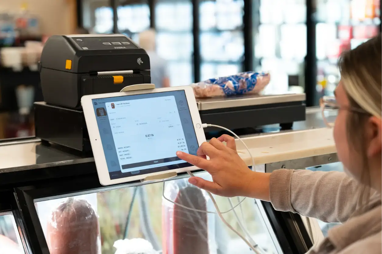
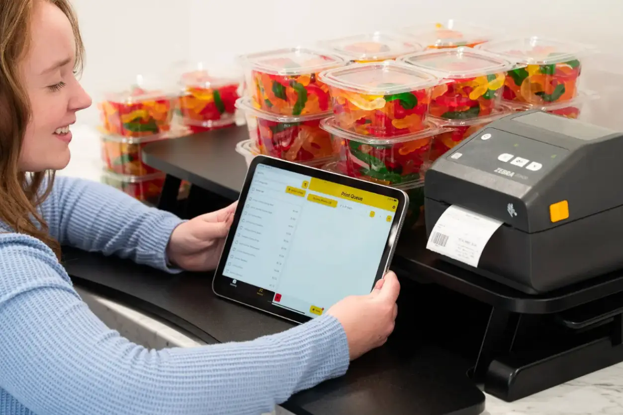
Clear, consistent shelf labels do three things at once. They confirm the price the customer expected, they keep the shopper moving with confidence instead of hesitation, and they reduce the questions your staff has to answer at the register. Stores running SwiftLabel for shelf tags pull pricing directly from their Square catalog, so what is printed on the shelf actually matches what rings up at checkout. That single match removes one of the most common friction points in small retail — the customer who grabs an item, sees a different price scan, and either argues or abandons the sale.
The opposite version is just as predictable. Faded tags, missing prices, or shelf labels that do not match the POS create the exact behaviors you do not want: hesitation, abandonment, and lost trust.
Simple Layout Adjustments Any Small Retailer Can Make
A remodel is rarely the answer. Most layout problems can be fixed in an afternoon with no construction and no new fixtures.
Move your highest-margin products to eye level on the right side of the main path. Most stores stock these where they have always been, not where shoppers actually look. Reposition impulse items to the lead-up at checkout, not the checkout itself, so customers are not forced to stop in a busy lane. Clear the decompression zone of any product you actually want to sell — that real estate is for orientation, not merchandising.
Update shelf labels everywhere prices have changed in the last 90 days. This is the cheapest, fastest layout fix available and it produces immediate behavioral results. Add directional signage at every spot where you have watched a customer backtrack. If three different shoppers got lost in the same aisle, the aisle is the problem.
None of these require a contractor. They require an hour of watching the floor and a willingness to move things that have been in the same place since you opened.
A decompression zone is the area just inside a store entrance where shoppers transition from outside to inside. Customers rarely register or purchase products placed here, so it should be kept open and uncluttered to let shoppers orient themselves before they start buying.
Store layout directly influences how long customers stay, which products they see, and how much they spend. Layouts that guide natural traffic flow toward high-margin products consistently outperform those built purely around storage efficiency.
The power wall is the first full wall shoppers see when they enter and turn right. It receives the highest visual attention of any area in the store and is typically used for high-impact displays, seasonal product, or best-selling items you want every customer to notice.
Small retailers can improve layout by moving high-margin products to eye-level positions on the right side of the main path, updating shelf labels for clarity and price accuracy, adding directional signage where shoppers tend to backtrack, and keeping the decompression zone clear of product clutter.